Category Archives: This or That

University Vs. College

Every year my alma mater prouding announces its placement in the US News ranking of the top colleges in the midwest. This year they placed 16th.

A year ago they changed the name from “Huntington College” to “Huntington University.” The argument was that a number of other schools were adopting the “university” label, and there seemed to be solid data that the “university” tag would increase the school’s stature in people’s minds. And maybe it does. I’m not sure it makes much diff to US News. Only 10 of the top 50 schools, and only 2 of the top 10, have the “university” label. I just found that interesting.

Share Button
1 Comment

In Defence of Madonna

I read in one of my magazines that Madonna is getting involved with relieving suffering in the African nation of Malawi–raising and contributing money, and promoting awareness of the needs in Malawi. This is a good thing. However, the article said Madonna has never actually been to Malawi, and suggested cynically that maybe this was some celebrity good-cause stunt. I don’t think it is. But it’s interesting that Madonna is drawn to a place she’s never been.

But then–how different is that from a lot of missions promotion? Across our churches you’ll find people who have a special burden for a particular part of the world that they, personally, have never visited. Might be Africa. Might be China. Might be Latin America. Might be India. The interest could have been sparked by any number of things–a missionary they know who serves there, an article or book they read as children that sparked an enduring fascination, a family member who once visited there, or even just purely a God-prompting.

You can be genuinely concerned about a place, even highly knowledgeable about it, without having actually visited. Though visiting certainly helps.

So, I guess I’m on Madonna’s side. If you have a burden for Malawi and want to help‚Äîyou go, girl!

Additional Note: After posting the above, I remembered hearing a few days ago that part of Madonna’s standard contract is that her accommodations include a brand new toilet seat, which must be unwrapped in her presence. Yeah, I doubt she’s going to Malawi anytime soon.

Share Button
Comments Off on In Defence of Madonna

The Weather Channel

If the sky looks the least bit dark to the west, or to the north or south, there’s only one thing to do: check Channel 74. The Weather Channel. Sure enough, there’s a big patch of yellow, with some mean red inside. The shape changes slightly with each sweep of the radar.

I’m trying to remember life before Channel 74. We had little more to go on than a little “T-Storm Watch” notice in the upper left-hand corner of the TV. My, how vulnerable we were. That was a scary, scary world.

I remember, long ago, going for an extended bike ride when I spotted a huge thunderstorm coming from the west, with lots of lightning, between me and home. I was on the northeast side of Huntington, out on country roads. I pedaled furiously. The torrent struck just as I reached the outskirts of town. I could hardly see through my glasses. But I raced on back to my apartment, totally drenched.

If The Weather Channel had existed, I probably would never have left the apartment. I would have seen that patch of red surrounded by yellow surrounded by green and wisely avoided that little misadventure. Like a wussy. But I would also be searching for something to write about.

Channel 74 is surprisingly accurate. We can look at the screen and declare, “Yesiree, looks like it’ll miss us by a couple of miles. Probably nail the Village of Coventry.” The other night, we were supposed to get rain to finally cool down the place. I checked Channel 74 before going to bed. We were getting missed, but a long horizontal string of storms stretched across southern Michigan. I did not think to offer a prayer for the poor slobs living in its path. Of course, we got hit the next day. We watched it. On Channel 74.

Anyway, thank God and Mighty Doppler for Channel 74. Like so many things in our 21st Century lives, so replete with gadgets and services and ready information, it’s one of those things we think we can’t live without.

Share Button
Comments Off on The Weather Channel

The Hummer Not-So-Status-Anymore Symbol

Every time I pass an H2 Hummer on the road, I chuckle inside. What were they thinking! Somebody needs to buy them a copy of Gas Mileage for Dummies.

But then, people driving Mini-Coopers probably say the same thing when I drive past them in my Dodge Dakota pickup. But that’s okay. Who’s laughing when they need to haul a load of mulch?

A while back, I read an article about why people buy SUVs. One salesman told of a woman in southern California who said she really needed four-wheel-drive on her SUV, because when she goes to parties at people’s houses, she often has to park on the grass. What a riot.

Share Button
Comments Off on The Hummer Not-So-Status-Anymore Symbol

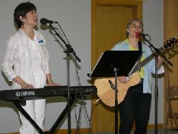
The Braeded Chord – It’s About the Lyrics

Braeded Chord
Doris Au MacDonald (left) and Sharon Dennis performing in Chambersburg, Pa.

I feel some affinity with Doris Au MacDonald, considering our mutual expertise in writing, graphic design, and music, and our shared background as UBs in the far west. Doris has spent her entire adult career in missionary service with Wycliffe, and I think the world of Doris and her husband, Alan. These are quality people, quality Christians.

But during my junior high Bible Quizzing days, Doris was The Enemy. She and her older sister, Margo, the Au sisters, starred for the team from the United Brethren church in Glendale, Calif., in the LA area. This church had a glorious quizzing history, having won a couple of Pacific Conference championships, from what I had heard.

I was among six bratty 7th and 8th graders from Lake Havasu City, Ariz., a new church with a first-year team. And we won the conference championship. Lucky upstart pipsqueaks.

Actually, it was the San Diego team that we despised, a gaggle of emotional, moody, highly-competitive girls who never lost without shedding buckets of tears and accusing the universe of unfairness. There was one guy on the team, always sitting in the number 4 chair, and we liked him. But his teammates–not so much.

Read more »

Share Button
1 Comment

Defacing My $20 Bill

This morning after getting the stitches removed from my gums, I went to Scott’s grocery store to get some donuts and other culinary supplies. I gave the checkout girl a $20 bill, and then watched her pick up a black Sharpie and put a little tick-mark just to the right of Andrew Jackson’s head.

“Why did you make that mark?” I asked her.

She said, “Some of the other Scott’s stores were having trouble with their twenties, so we’re all doing this.”

“Oh,” I said. As if that answered my question, which it most certainly didn’t. But being unduly polite and not wanting to embarrass her, I didn’t question further. I just accepted her answer like a lemming, collected my change, and left to enjoy creamy vanilla filling.

But ever since, I’ve been wondering, “So what kind of a problem can a store have with a $20 bill? And why does defacing the bill with a black mark solve that problem? And why was I too timid to ask this question of vital concern to our national currency?”

Share Button
1 Comment

Trivial Quote

I liked this. Someone on the ChurchMedia.net forum uses this as a signature:

God is good, all the time
Sometimes it’s obvious

This is a reminder that sometimes, God’s goodness is not obvious…but he’s still good.

Share Button
Comments Off on Trivial Quote

Nine Web Design No-Nos

One of my seminars at the Church Media conference last week dealt with web design. Frankly, I didn’t learn a whole lot; after all, this is something I do professionally. But I did get a kick out of the leader’s “Six Things Never To Use in Web Design.” I agreed with all six, and added three of my own. So that’s nine items. I’ve been trying, hard, to come up with a tenth thing, but though I’ve had some good candidates, nothing has surfaced as a rock solid “definitely don’t do this.”

So, I’ll run with the nine. Most of these were popular in the 1990s, and should have died in the 1990s, the early days of the web. And most of these are very common on local church websites, a fact of life which pains me greatly.

1. Frames. Don’t design web pages with frames. It is so 1990s. Some browsers have trouble with frames. And if you care about Google rankings, definitely avoid frames. (I’ve never designed with frames.)

2. Scrolling banner text. This comes under the heading “Don’t do it just because you can.” Designers see that their program enables them to scroll text, so they do it. It’s just annoying. Like the similar FX in Powerpoint, where letters come flying across one at a time to form words. Don’t do it just because you can.

3. Animated GIFS. I hate sites that are plastered with cutesy animations that the designer stole from somewhere else.

4. Hit counters. Don’t put these on your website. They look amateurish (from a design standpoint), and “hits” are not like the more accurate “visits” (by accessing my blog homepage, I got probably a dozen “hits” as you accessed pieces of artwork, plus my javascript and CSS pages).

5. Patterned backgrounds. You can download gobs of square patterns to use as backgrounds for your pages. In general, avoid them. They look cheap.

6. Template buttons and art. You can buy a CD with thousands of graphic buttons; you just add your words to it. Plus lines, shapes, stars, symbols, and all kinds of other things. All of which look cheap. They also take extra time to load, as opposed to using textual links and buttons, which is the current standard (in tandem with Cascading Style Sheets).

7. Midi music. If I come across a site with music playing on it‚Äîthat’s the quickest way to get me to close the page. Especially if I’m at work. Music is especially annoying on ebay.

8. Splash screens. This is a page you’re forced to endure before getting to the actual page you want. You certainly don’t want to see it every time you visit that site. Instead of directly entering the store, it’s like being forced to come through another entrance with a special waiting room. Splash screens kill you on Google rankings, and studies show that up to a third of people never go beyond the splash screen. I click out of them as fast as possible.

9. Under Construction pages. I constantly have pages under construction‚Äîbut I don’t advertise that fact. I only link to a page or a section when it’s done. Nobody wants to be taken to an “under construction” page. It just wastes your time. When you have something there, then give me a link. I’m not interested in your master plan or good intentions.

Any candidates for a 10th item?

Share Button
2 Comments

The Taylor Van Tragedy

taylorgirls.jpgEveryone in Fort Wayne has been talking about a tragedy which occurred five weeks ago, when a semi truck crossed the median on I-69 and struck a van carrying people from Taylor University, killing five of them. One girl was in a coma for five weeks, and she was identified as Laura VanRyn (left). But when she came out of the coma, she identified herself as Whitney Cerak (right)–a classmate who had been named among the dead. A case of mistaken identification.

What makes the story extra amazing is the response of the two families involved (especially the VanRyns, who had been keeping a bedside vigil over a girl who, it turns out, was not their daughter after all). I was going to write about this. It’s such an unusual, compelling story. But now I see a post by Ed Gebert on his blog about the whole thing. No reason for me to plow the same ground.

Share Button
Comments Off on The Taylor Van Tragedy

Complex Coffee

I stop at Starbucks most mornings on my way to work. I did today. They always have three coffees available–a medium or mild roast, a bold roast, and decaf. The three selections are scribbled on a chalkboard with brief descriptions. And the descriptions contain words like these: bold, smooth, soft, well-balanced, nutty, herbal, fruity, earthy notes, spicy, sparkling, acidic, light, robust, citrusy. And my favorite: complex.

starbucksI don’t know what those mean. I’ve never sensed any nuttiness in coffee. No hints of oranges or mangoes or any other kind of fruit. To me, there are two types of coffee: strong, and not-so-strong. And decaf versions of each. Okay, I should add a third type, the kind grandpa always had sitting on the stove in the farmhouse, a roast which I call Terminal Stomach Radiation. Starbucks has nothing similar, beyond stuffing a handful of Komodo Dragon beans into your mouth.

Life needs to be kept simple pre-coffee. I don’t want to enter Starbucks and be confronted with difficult decisions: “Do I feel like nutty, or smooth? How many earthy notes can I handle today?” Before coffee, I can barely locate my truck in the garage. I just want to say, “Gimme coffee,” and leave. Then, having consumed my morning brew, I’m empowered to make decisions during the rest of the day. Never mind that I usually get decaf. There’s a psychological thing going on which still perks me up, enlivens my senses, as though I’m still mainlining caffeine. Let nothing jeopardize that illusion.

Anyway, I certainly don’t want “complex” coffee first thing in the morning. I want it strong or not-so-strong, and I don’t want to put any further thought into the purchase. Thank you.

Share Button
3 Comments

Receive Posts by Email

If you subscribe to my Feedburner feed, you'll automatically receive new posts by email. Very convenient.

Categories

Facebook

Monthly Archives